 Salesforce Developer Evangelist alumnus Ron Hess asked me this question a few days ago: “I love the new Analytics API! I want to pull the data into a Visualforce Page (or Apex Class). Can I use ForceTK to do this? Can I access the Analytics REST API using the proxy?“. That’s a great question, but before I go ahead and explain the answer, I’d better explain the question, for folks that might be scratching their heads at the mention of ForceTK and proxies.
When we released the original Force.com REST API, back in Spring ’11, one of the most frequently asked questions was ‘Can I call the REST API from a Visualforce Page?”. At the time, the REST API was not exposed on the Visualforce servers (c.instance.visual.force.com), and, due to JavaScript’s Same Origin Policy, it was impossible to call the REST API endpoint on instance.salesforce.com directly. I realized that the Ajax Proxy, created to allow JavaScript on Visualforce pages to call out to third party web services, such as Google, would also allow JavaScript on Visualforce pages to call in to the Force.com REST API. I wrote a little library, the Force.com JavaScript REST Toolkit, or ForceTK for short, enhanced it a couple of times to support JavaScript served from web servers outside the Salesforce Platform, and hybrid apps on PhoneGap, and all was good.
ForceTK’s main job is to wrap the REST API with a JavaScript interface – you can call methods such as create() and upsert() rather than dealing directly with XmlHttpRequest or jQuery.ajax(), but it also exposes its own low-level ForceTK.ajax() method, which accepts a partial URL path, HTTP method, payload, etc, but saves you from having to deal with OAuth tokens. ForceTK.ajax() is the key to calling REST APIs such as Analytics without any heavy lifting.
The Analytics REST API itself is new in the Winter ’14 release, and it’s worth mentioning that the longer term plan is to provide similar functionality in an Apex API, in the same way that the Chatter REST API preceded Chatter in Apex. Having said that, though, right now, the Analytics REST API is the only supported mechanism for loading Report data, so we’ll go ahead and work with it.
Now we’re all on the same page, let’s look at how you’d use the Analytics API on a Visualforce Page to pull Report data from Salesforce so you can show a custom visualization using Google Charts. I’ll walk through the code highlights in this blog entry, but you can grab the entire file here.
Code Walkthrough
After defining some CSS, we include the jQuery, ForceTK and Google API Loader (JSAPI) JavaScript libraries. We’ll use JSAPI to dynamically load the Google Charts library.
Skipping down to the $(document).ready() handler, the first thing we do is read a Report ID from a query parameter. Passing reportId to the page makes it much more versatile.
If we successfully found a Report ID, we initialize ForceTK and define a variable to hold the Report data:
Now we can go ahead and call ForceTK.ajax() to run the report synchronously. Notice that the URL path is relative to /services/data:
In the anonymous callback, the first thing we do is save the report data in the report variable, then write it to a <pre> element on the page. You wouldn’t do this in production, but it’s essential for development – you really want to be able to see the raw report data.
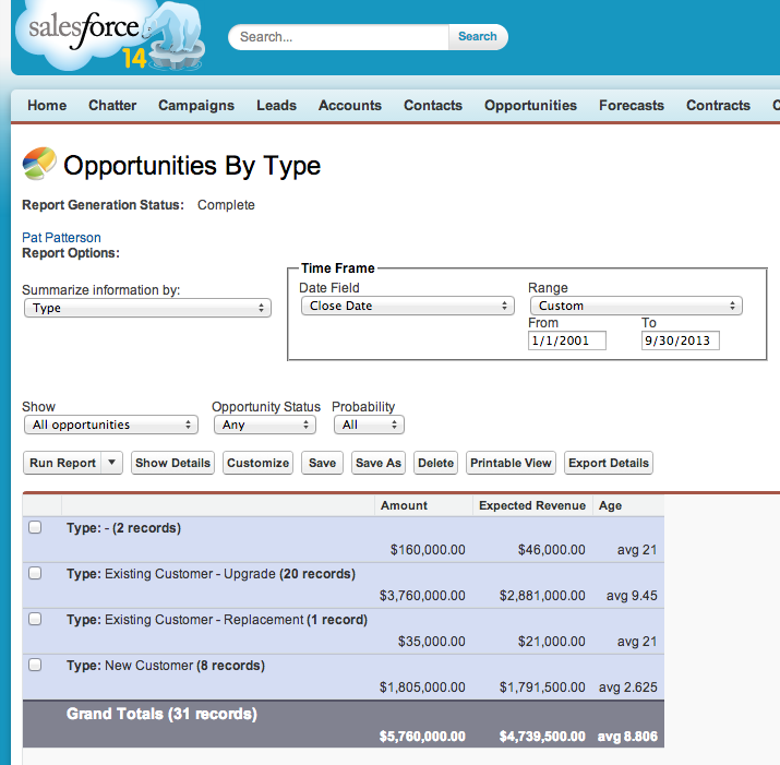
In this example, I’m using one of the standard example reports included in Developer Edition: ‘Opportunities by Type’. In the regular report view, this tells us the total amount, expected revenue and age of our Opportunities, broken out by their Type:
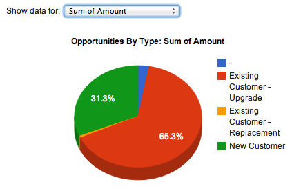
What I want to do is show a Pie Chart of a single column of that data, and let the user switch between columns via a drop-down list, like this:
So the first thing we need to do is populate that drop-down from the list of aggregate columns in the report metadata. The Analytics API documentation discusses the Report data format in some detail, suffice to say here that I’m iterating through the aggregate columns in the report, extracting the column labels:
Now we can render the pie chart. We break this out into its own function, renderPieChart(), so we can call it both after the data loads, and when the user selects an aggregate column in the drop-down. After setting a default column, renderPieChart() loads the Google Chart library:
Once the library has loaded, we can extract labels for the grouping and aggregate columns. The first entry in the data array that we pass to the Google Charts library has to contain metadata, rather than the data itself, even though it’s not shown on the pie chart. Still, we populate the array with the actual labels, rather than dummy strings, in case we want to reuse the code in a different context.
Now we can iterate through the report summary data and create the DataTable object that the Charts API uses:
We want to label the chart according to the data being shown, and format the data appropriately when we’re showing currency fields:
Now, at last, we can create the chart, and pass in the options and data:
And the finished result. Again, you wouldn’t show the raw JSON report data to users, but it’s essential during development for understanding the report structure:

This example showed JavaScript calling the API from a Visualforce page, but the great thing about ForceTK is that you can use exactly the same code from a page hosted anywhere – even in a hybrid mobile app – by just tweaking the initial call to pass a session ID to the ForceTK client.
The Salesforce Analytics REST API unlocks analytics data for developers, and the ability to call the API from JavaScript on Visualforce pages and elsewhere enables a whole new world of dynamic apps leveraging the Salesforce Platform. What are you going to build with the Analytics API? Let us know in the comments!